It’s the overly perfect chalkboard style lettering. It’s like it’s rounded sans serif but hand written in a way that’s too even.
The letters aren’t the same width from line to line, and the ellipses/period spacing isn’t the same from line to line (but is perfect on any given line).
Basically, any typed sign in InDesign or similar software would’ve been more even between lines, and any hand-drawn sign would’ve been more imperfect on any given line.


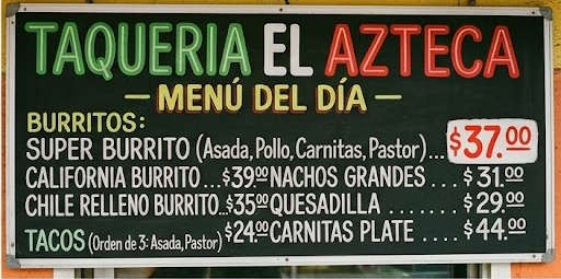
It’s the overly perfect chalkboard style lettering. It’s like it’s rounded sans serif but hand written in a way that’s too even.
The letters aren’t the same width from line to line, and the ellipses/period spacing isn’t the same from line to line (but is perfect on any given line).
Basically, any typed sign in InDesign or similar software would’ve been more even between lines, and any hand-drawn sign would’ve been more imperfect on any given line.